Acrylic
|
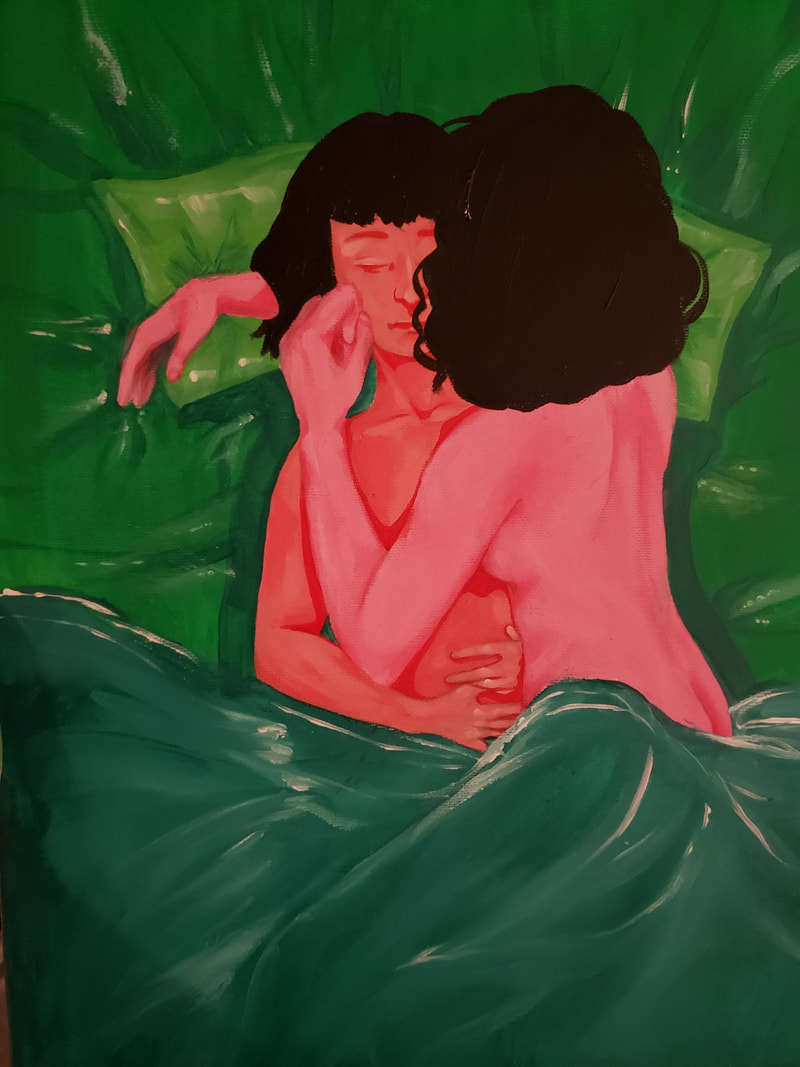
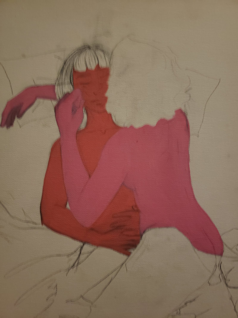
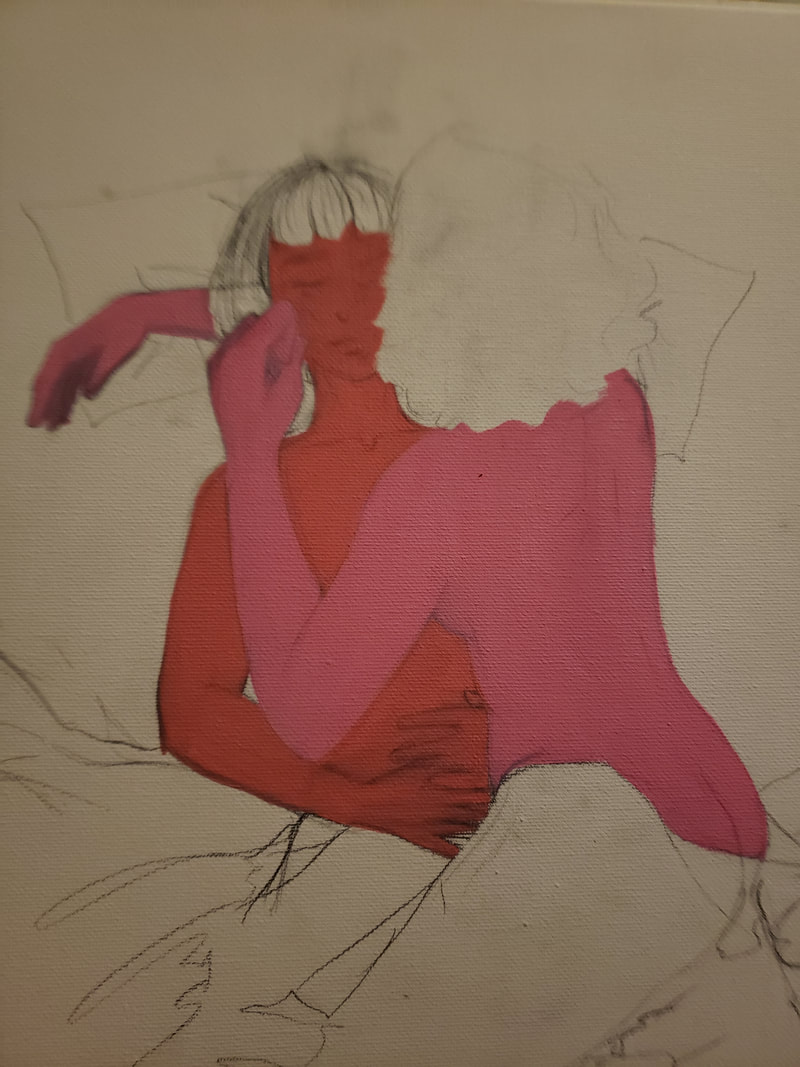
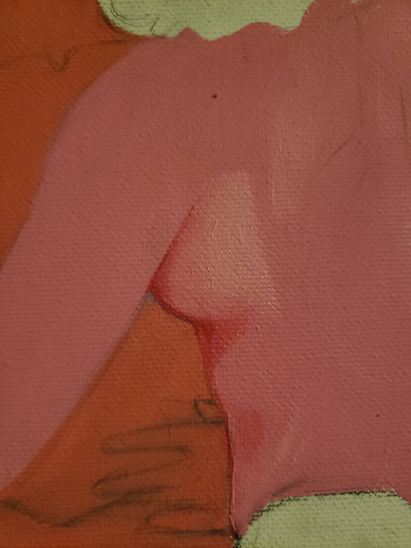
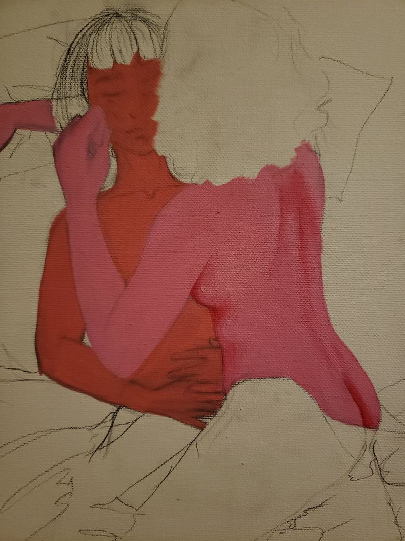
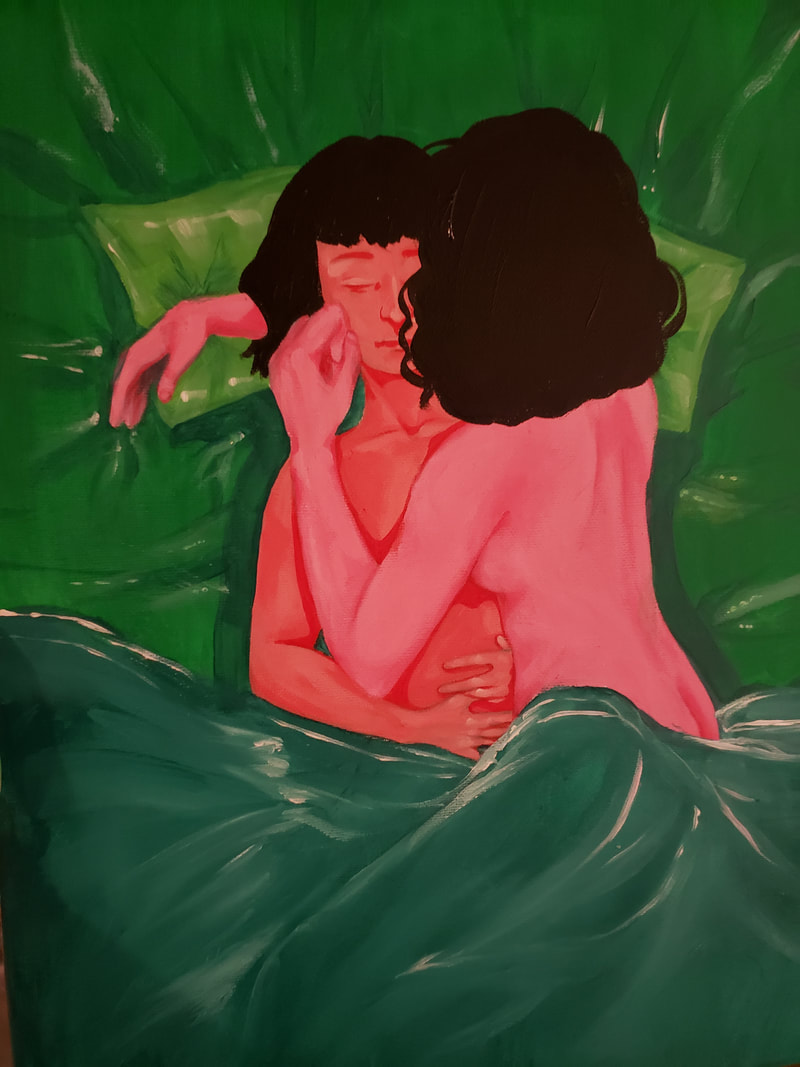
Artwork: Acrylic Painting
Title: Sleeping with you II & III Size: 2ftx1ft Medium: Acrylic on canvas Completion: 10/2/19 |
Exhibition Text
These pieces reflect how people are just people and should be allowed to love whoever they please without ridicule. Throughout my life I have been faced with vary contradictory views on love, and who it is "allowed" to be with. One side of my family is very open and embraces same sex love, where the other side is very close minded and is against it. Therefore inspiring the use of contrasting colors.
Inspiration
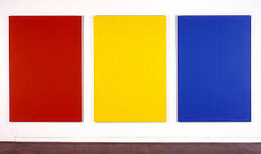
Red, Yellow, Blue II
By Ellsworth Kelly |
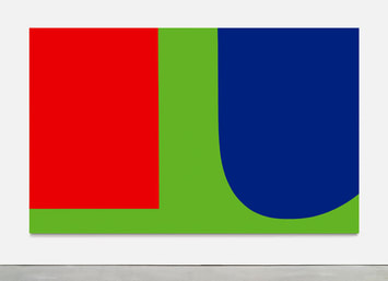
Red, Blue, Green
By Ellsworth Kelly |
Ellsworth Kelly inspired my piece by the use of color, and how he uses other colors to contrast each other to make them stand out. In Red, Yellow, Blue II presents primary colors in their most basic state, and emphasizes the true importance of primary colors. As primary colors cannot be recreated by any other color. Red, Blue, Green uses blending and contrast. My pieces focus on the contrast of colors, to emphasize the meaning between the two people pictured in each piece. Ellsworth Kelly was born in New York in 1923, and was the second oldest of three. He studied technical art and design at Pratt institute from 1941-1942, he then enlisted in the army in the camouflage unit called "The Ghost Unit" and misdirected the enemy with inflatable tanks. The use of camouflage and the shapes he encountered when in the service helped shape his career and future success as an artist.
Planning
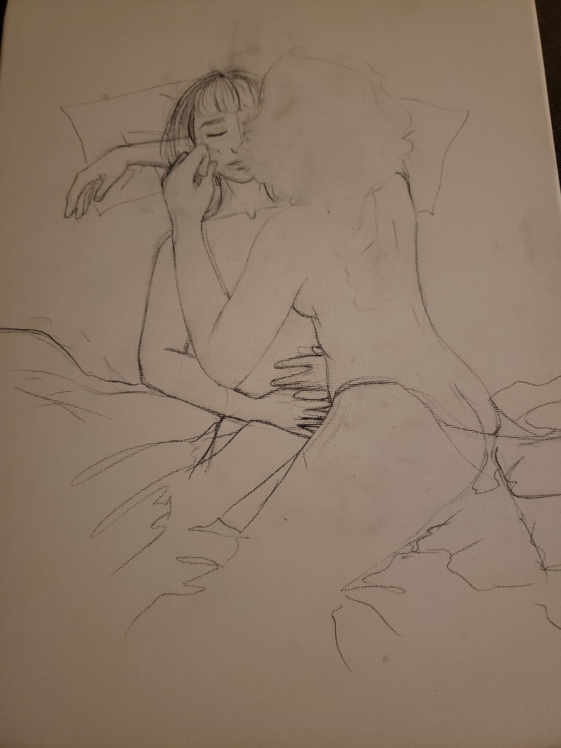
I sketched the image that I desired onto the canvas, I really wanted to capture the loving nature of women, and the love experienced between two people.
|
I originally was going to create one person sleeping dreaming of sleeping with another person, but the meaning of the painting, came off better when it was two people sleeping together.
|
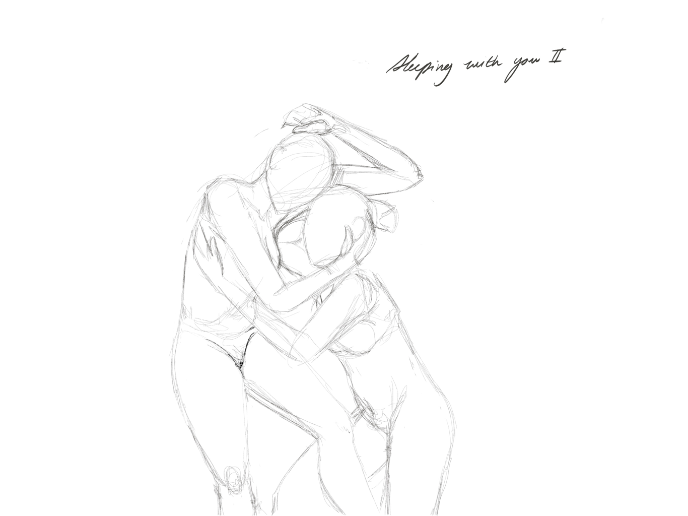
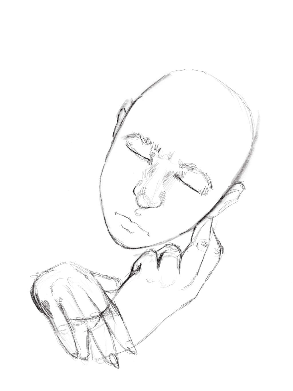
I experimented with different poses, I really wanted to emphasize embrace, and the feeling of total contentment, safety, and love.
|
Process/Technique/Experimentation
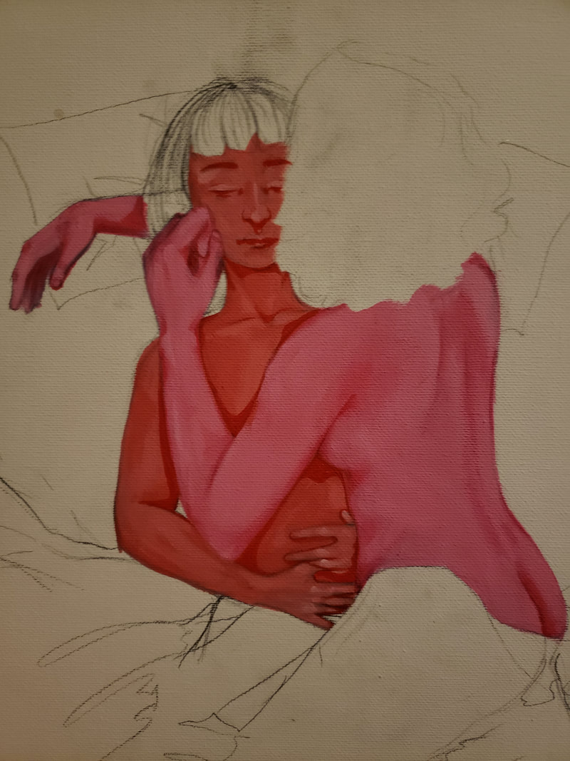
Step 1. I sketched out the pose that I wanted to display, based on the sketches i had previously created.
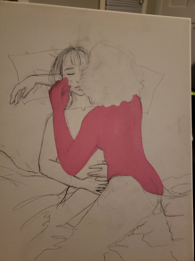
Step 2. I started painting in red hues to stay true to the theme of contrasting primary and secondary colors. I used red and green in this piece to add the importance of the two figures.
Step 3. I went through and painted the highlights on the top figure as if the light was shining on them. I made sure to pick one point of origin from above so it looks like the figures are being looked down on.
Step 4. I then went back and created the shadows of the figures' forms. to create the effect of light shining down on the figures
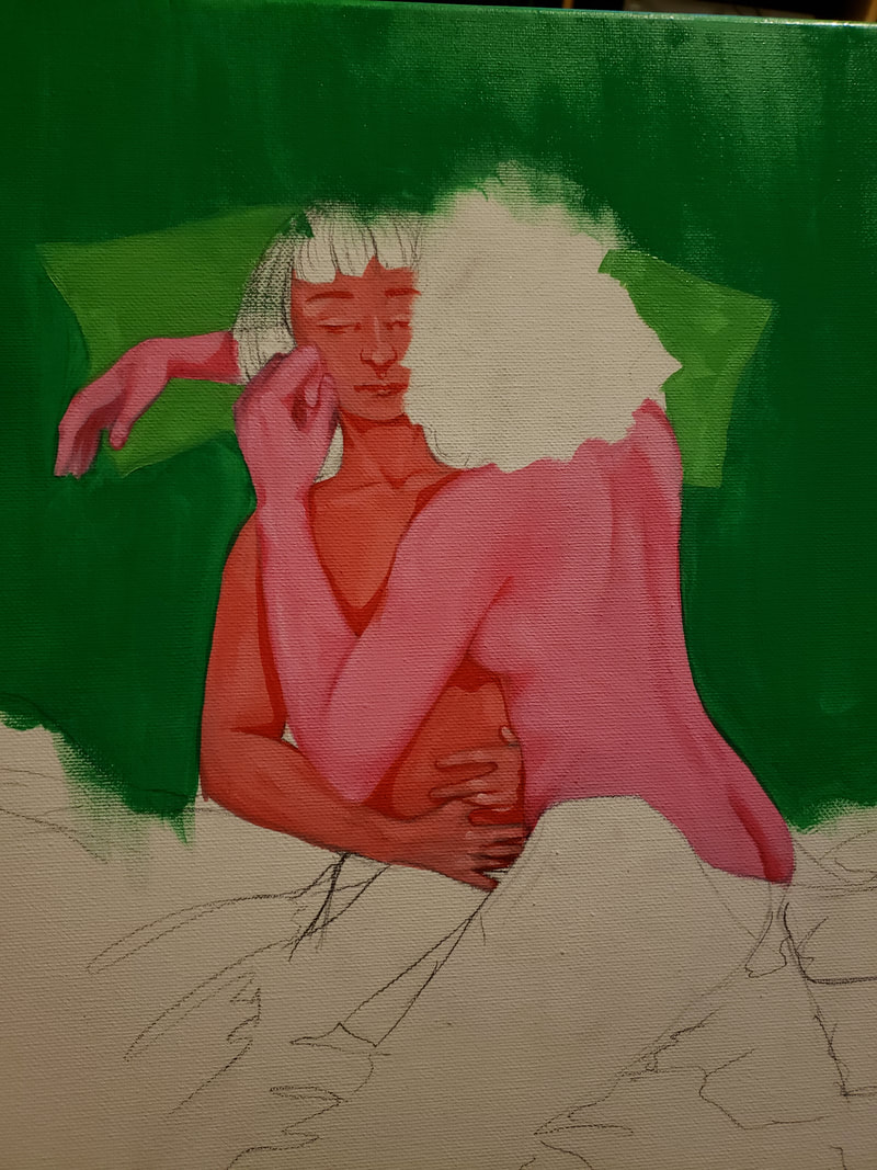
Step 5. I then started creating the green background, I started with a solid green background. A lighter green for the pillows, the medium green for the sheets, and the dark green for the blanket.
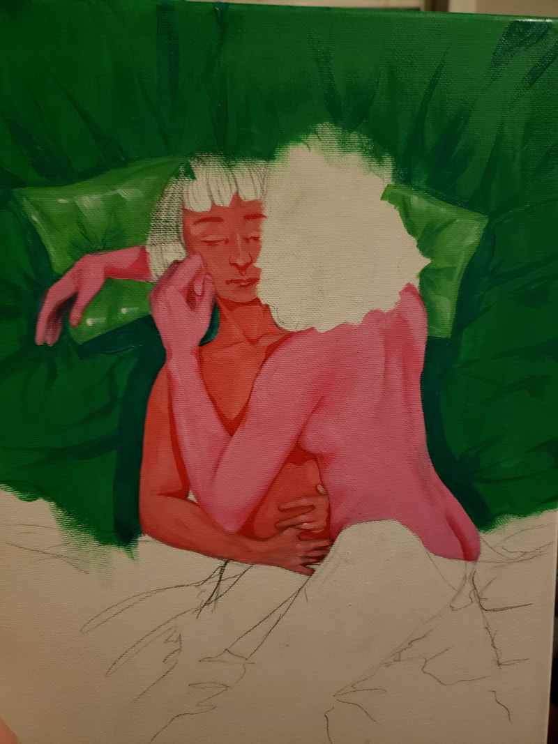
Step 6. I then added highlight and shadows to make the bed have a silky texture.
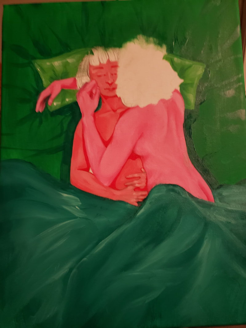
Step 7. I decided to make the hair black to add contrast to the white highlights and create the absence of color, to better appreciate the forms featured.
Step 2. I started painting in red hues to stay true to the theme of contrasting primary and secondary colors. I used red and green in this piece to add the importance of the two figures.
Step 3. I went through and painted the highlights on the top figure as if the light was shining on them. I made sure to pick one point of origin from above so it looks like the figures are being looked down on.
Step 4. I then went back and created the shadows of the figures' forms. to create the effect of light shining down on the figures
Step 5. I then started creating the green background, I started with a solid green background. A lighter green for the pillows, the medium green for the sheets, and the dark green for the blanket.
Step 6. I then added highlight and shadows to make the bed have a silky texture.
Step 7. I decided to make the hair black to add contrast to the white highlights and create the absence of color, to better appreciate the forms featured.
I experimented with the silky texture by creating the bright highlights and harsh shadows. I also used a flat brush to create the highlights and shadows in both the figure and the bedding, I found it easiest to create harsh lines with. when creating the highlights in the sheets i also used globs of white paint and wiped it away with a paper towel to create an airbrush effect.
Reflection
I was inspired by the colors and contrast used within Ellsworth Kelly's work and used the primary to secondary contrast in my piece. I found it really difficult to create a straighter line, because when I created this piece I had cut my pointer finger at work and was unable to bend it. Since my main guiding finger was immobile I found it quite difficult to create certain brushstrokes and textures. However I found different ways to create textures, for example: I was able to create a soft highlight to mimic silk by globing paint onto highlight areas, and wiping it with a paper towel. Overall I was quite happy with this piece, because It matches "sleeping with you" quite nicely, I am planning on adding one more piece to add to the meaning and acceptance of same sex love.
Act Questions
Clearly explain how you are able to identify the cause effect relationship between your inspiration and its effect on your artwork?
I was inspired by the colors used by Ellsworth Kelly in his pieces, and I used the primary-secondary contrasts within my pieces.
What is the overall approach the author has regarding the topic of your inspiration?
An informational approach that informs the reader of the use of color by Ellsworth Kelly, comparing it to the color scheme used within my piece.
What kind of generalizations and conclusions have you discovered about people, ideas, culture, etc. while you researched your inspiration?
The shapes that Ellsworth Kelly encountered in the army inspired the shaped used within his artwork.
What is the central idea or theme around your inspirational research?.
Ellswoth Kelly's use of line and color to create contrast between shapes, and the balance of the piece.
What kind of inferences did you make while reading your research?
Ellsworth Kelly wants his pieces to stand out to contrast the camouflage that he encountered in the service.
