MIAD Project
|
Artwork: MIAD Project
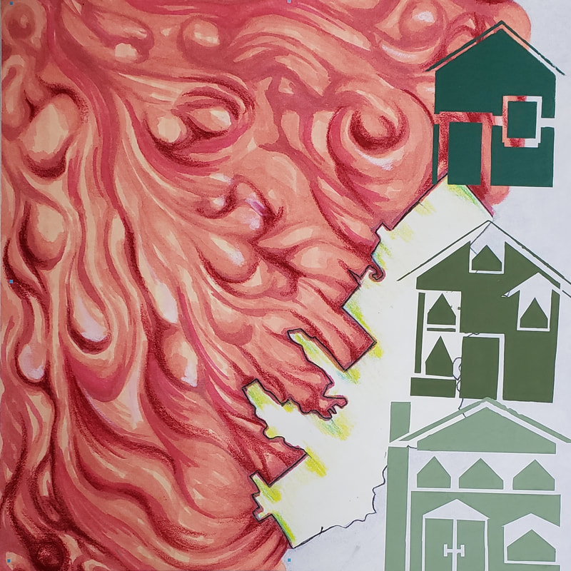
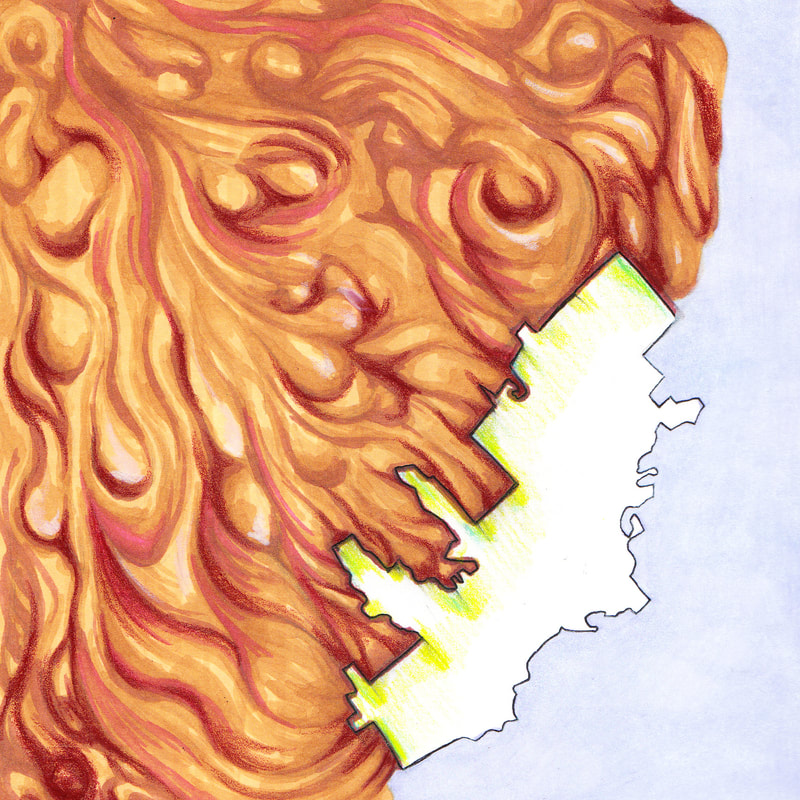
Title: Reasons Size: 3x3ft Medium: Acrylic based ink on Tyvek Completion: 10/30/18 |
|
Artwork: MIAD project
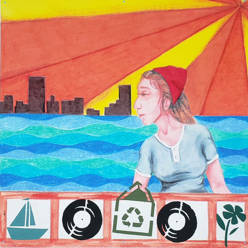
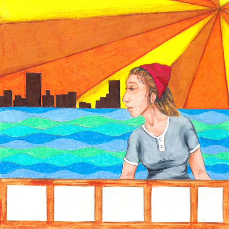
Title: Bay view Size: 3x3ft Medium: Acrylic based ink on Tyvek Completion: 10/30/18 |
Exhibition Text
For Reasons my intentions were to capture the reasons of polish immigrants leaving their country and moving into Milwaukee in an abstract and eye catching fashion. I was inspired by the textures used by H.R. Giger to enhance natural forms because the majority of the reasons people left Poland was due to agricultural issues. The stencils portray the story of how polish immigrants went from the poorest to the richest immigrants through real estate. This piece was made by using Prismacolor markers and Prismacolor colored pencils for the initial drawing, and for the final image I used Adobe Photoshop CS6 and put it on a 36x36in background with a 200 resolution for the capability to be stretched onto a 3ft by 3ft piece.
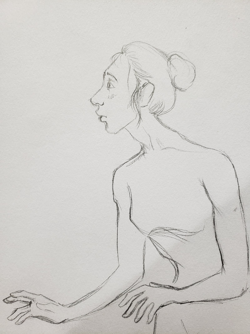
For Bay view I wanted to capture the retro and artistic vibe of bay view using retro patterns and colors. It is a very natural community and emphasized the need to recycle and home grown produce. I also wanted to show the importance of records and record stores in the community and how they are quite popular, I was inspired by Toulous Lautrec and his love for moulin rouge, How he portrays the vibe of the club inspired the initial idea and form of the woman shown on the piece. I also was inspired by the retro designs of Mathew Laznicka for the background of the piece and for the stencil designs. this piece was made by using Prismacolor markers and Prismacolor colored pencils for the initial drawing, and for the final image I used Adobe Photoshop CS6 and put it on a 36x36in background with a 200 resolution for the capability to be stretched onto a 3ft by 3ft piece.
For Bay view I wanted to capture the retro and artistic vibe of bay view using retro patterns and colors. It is a very natural community and emphasized the need to recycle and home grown produce. I also wanted to show the importance of records and record stores in the community and how they are quite popular, I was inspired by Toulous Lautrec and his love for moulin rouge, How he portrays the vibe of the club inspired the initial idea and form of the woman shown on the piece. I also was inspired by the retro designs of Mathew Laznicka for the background of the piece and for the stencil designs. this piece was made by using Prismacolor markers and Prismacolor colored pencils for the initial drawing, and for the final image I used Adobe Photoshop CS6 and put it on a 36x36in background with a 200 resolution for the capability to be stretched onto a 3ft by 3ft piece.
Inspiration
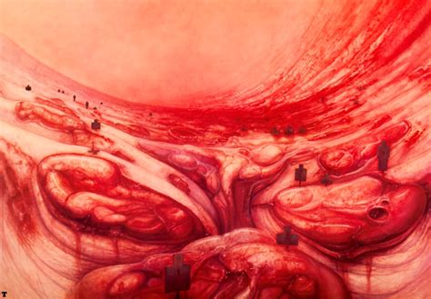
Landscape 1 by H.R. Giger
This piece Inspired my reasons piece because of the grotesque natural forms of the landscape. I wanted to use that texture to convey the natural reasons for the polish immigration into Milwaukee, and how it was mostly due to agricultural failure (potato famine). 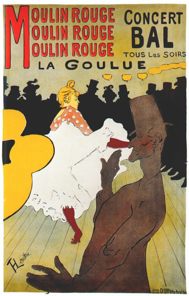
Moulin Rouge by Toulouse Lautrec
Moulin Rouge inspired the form of the woman seen in Bay View because of the almost exaggerated the human form and used simple colors and textures. |
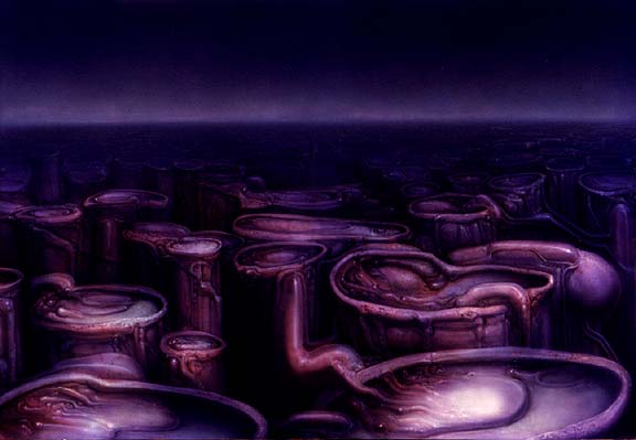
Landscape VII by H.R. Giger
This piece also inspired reasons because of the ordered structures within the Natural forms which gave me the idea of the economic stature of the polish and how they went from the bottom of the food chain to the top of the food chain through real estate. 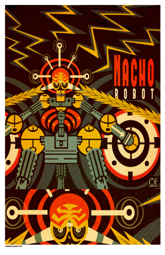
Nacho Robot by Mathew Laznicka
This piece inspired the contrast between orange and yellow in Bay View, and also helped me create the retro designs and patterns presented in Bay View. |
Process/Technique/Experimentation

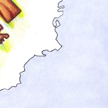
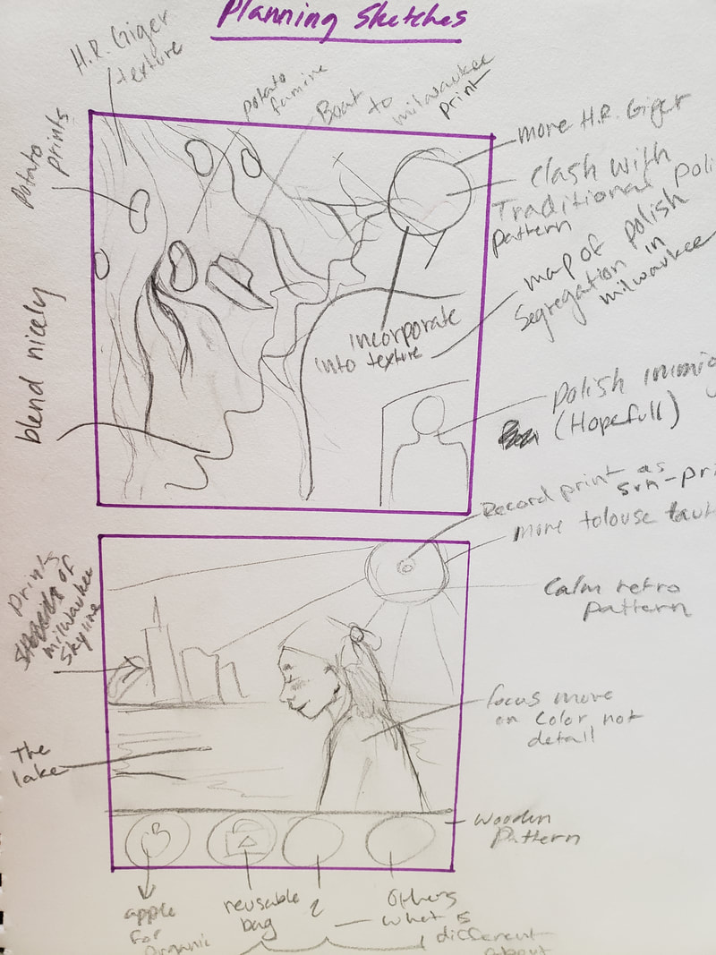
For reasons I had a hard time choosing which planning sketch I wanted to use but I went with the original idea in the end (Top).
For Bay view I practiced quite a few retro styled for the background to get what I desired, I experimented with Prismacolor markers and Prismacolor colored pencils to get a soft faded texture
|
Then I made my background with Prismacolor markers and Prismacolor colored pencils (the blue in the sky ended up being too dark so I experimented with the colored pencils to get the lighter desired look by putting white colored pencil over the marker).

Then I made my background with Prismacolor markers and Prismacolor colored pencils I wanted to use bright and busy colors to show the happy vibe of bay view and to direct the eye to certain areas of the piece. I wanted to emphasize the natural beauty of the lakeside community.
|
I used Adobe Photoshop CS6 and put it on a 36x36in background with a 200 resolution for the capability to be stretched onto a 3ft by 3ft piece.
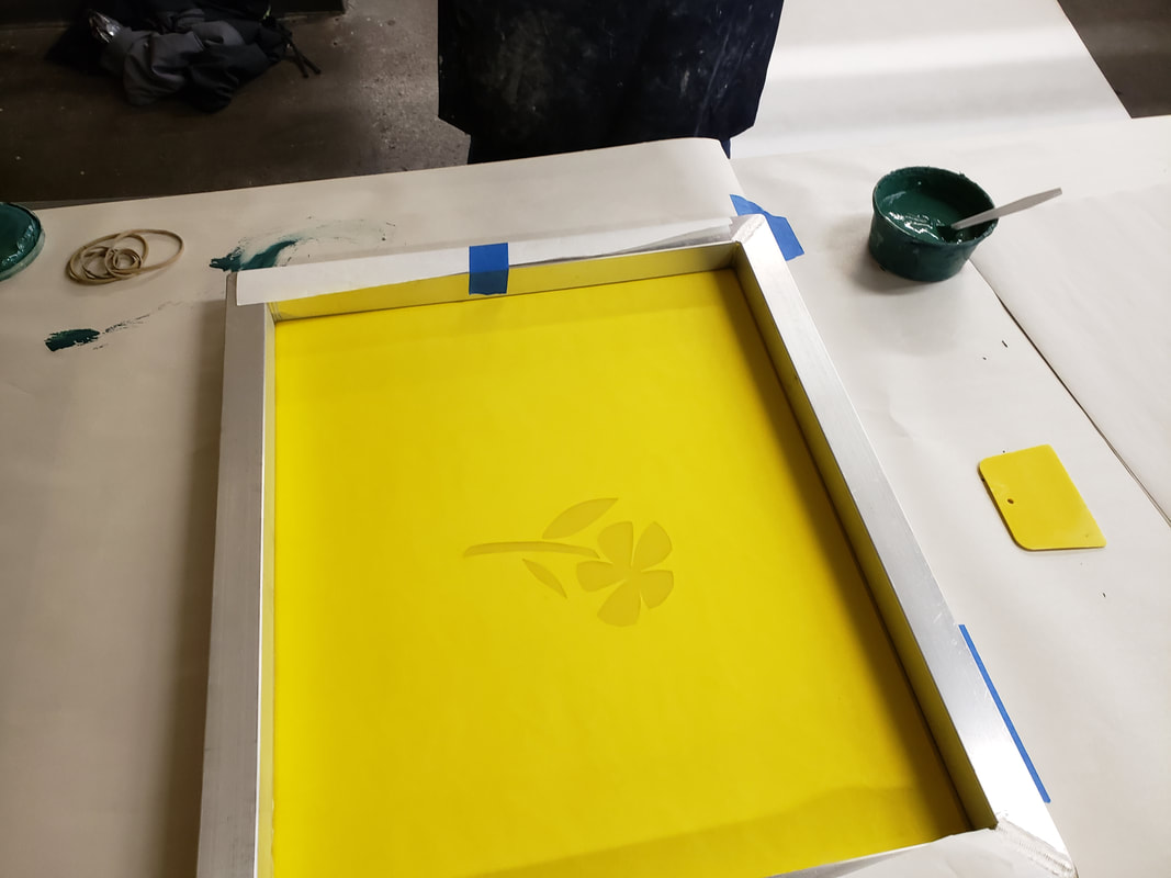
After the piece was printed on tyvek I made stencils of the houses to show the rise to the top through real estate I dabbled with a few designs before finally creating the houses desired. Then I went to MIAD and used their screen printing facilities. 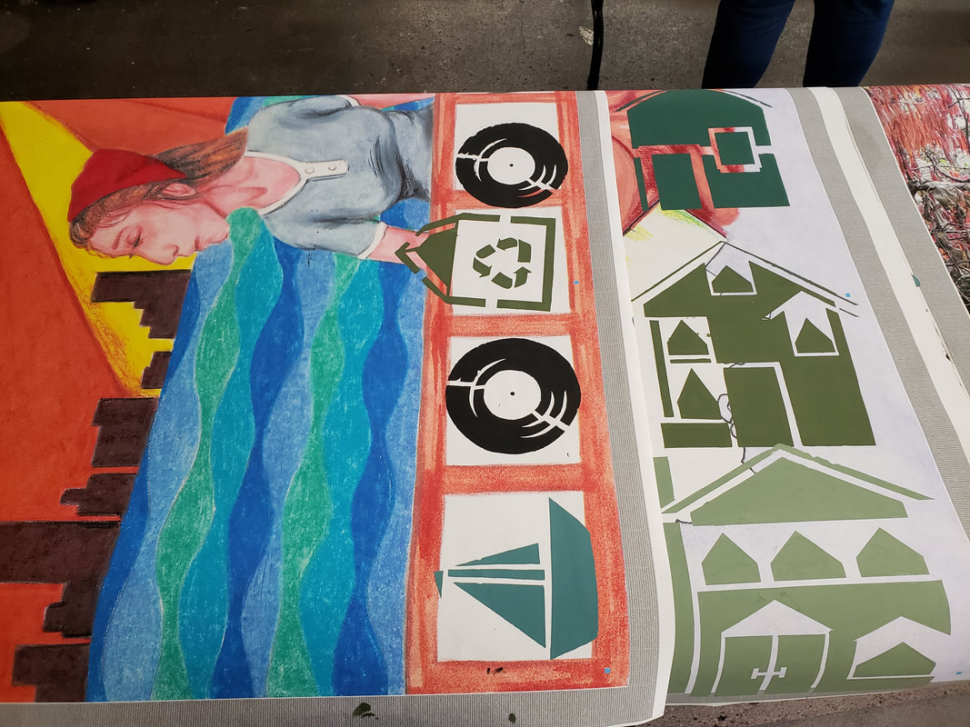
I used Adobe Photoshop CS6 and put it on a 36x36in background with a 200 resolution for the capability to be stretched onto a 3ft by 3ft piece.
After the piece was printed on tyvek I made stencils to represent the priorities in bay view and how it is a very natural community. Then I went to MIAD and used their screen printing facilities. |
Hadwritten pages:
|
|
Planning
Reasons planning sketches

|
|
|
For Reasons my intentions were to capture the reasons of polish immigrants leaving their country and moving into Milwaukee, H.R Giger's Landscape had a natural almost grotesque texture that I wanted to use it to show the bad in the reasons they were leaving, and how it was almost poisonous and toxic.
Bay View planning sketches
|
|
|
For Bay view I wanted to capture the retro and artistic vibe of bay view using retro patterns and colors. It is a very natural community and emphasized the need to recycle and home grown produce. I wanted to use retro/vintage patterns to show Bay View's vibe. I also wanted to incorporate bright colors to show the lakeside community's happy disposition.
Reflection
To create these pieces I used Adobe Photoshop CS6 and put it on a 36x36in background with a 200 resolution for the capability to be stretched onto a 3ft by 3ft piece. Creating stencils to portray the meaning of the pieces, and then taking everything to MIAD to apply our stencils to our tyvec backgrounds through screen printing. My intention for reasons is to portray my culture and my story of how I got to Milwaukee, and my intetion for reasons is to show my community of Bay View.
For My reasons piece that was inspired by the artwork of H.R Giger, both the inspiration and my piece resemble the same texture and natural formation of mass. Reasons also emphasizes the horrors of a corrupt society like H.R. Giger's work is also displaying. However, Reasons also is showing hope, and a safe haven in a new place like Milwaukee, unlike H.R. Giger's work which is nothing but hopelessness and despair. My piece starts in the left corner with a natural mass of reasons for the polish to leave. it then features this mass pushing its way into Milwaukee and forcing immigration to a new and better place. The smallest house represents how polish immigrants started as some of the poorest citizens in Milwaukee. The Middle house represents the start if their economic success through real estate. The largest house represents how they became some of the wealthiest citizens of Milwaukee. My initial concept went really well, and the textures I was able to recreate using colored pencil and Prismacolor markers. My stencils on the other hand could have been better. They ended up being bigger than I intended them to be, and it was hard to figure out how big I wanted them to be since I had to make them before I had the background printed on tyvek. Some of the challenges of this piece was making the house stencils themselves because of the need to plan out every detail.
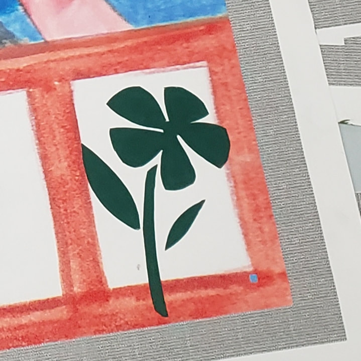
For Bay view that was inspired by the work of Toulouse Lautrec and Mathew Laznicka and the patterns and forms both pieces portrayed. My piece is similar to Toulouse Lautrec's Moulin Rouge because of the exaggerated form of the woman featured in my piece. However my piece did not feature the dark Club theme in Moulin Rouge. My Piece was similar to Mathew Laznicka's Nacho Robot, because of the colorful patterns and textures featured in his work. My piece does not relate to Nacho Robot's color scheme, as nacho robot only features four different colors, where mine features a repetition of colors but more than four. Bay View features a typical local bay view woman in front of lake Michigan at south shore park where the city of Milwaukee is featured in the skyline. The sky then shines bright to show the happy disposition of Bay view and the unique people who live there. I then featured four different stencils which showed the personality of bay view. A sailboat because it is a lakeside community, a record because bay view is obsessed with vintage items and vinyl, a recyclable bag because it is a very environmental and green community, and a flower to show people often have their own garden's and grow small crops. Some things that went well when creating this piece were how well all of these elements came together and became the essence of bay view and told the story of the community. However I had difficulty lining up the stencils correctly and they ended up being a little out of the squared areas. Overall I think it was a success and I enjoyed creating this piece.
Act Questions
Clearly explain how you are able to identify the cause effect relationship between your inspiration and its effect on your artwork?
I am able to incorporate elements of Toulouse Lautrec and Mathew Laznicka Into my artwork and evaluate the differences between their art and mine because I am not fully copying their pieces but rather mimicking their techniques. In Reasons my connection to the texture of H.R Giger, and the gruesome mass of reasons featured.
What is the overall approach the author has regarding the topic of your inspiration?
The author talks about my inspiration pieces from a historical stand point and has a hard time sharing their opinion on the piece. Except for Mathew Laznicka's piece because it was himself talking about his thoughts on his own work.
What kind of generalizations and conclusions have you discovered about people, ideas, culture, etc. while you researched your inspiration?
The polish culture is unique culture that are not afraid to work hard to get to where they want to be, they worked hard and economically climbed the ladder because of real estate.
What is the central idea or theme around your inspirational research?.
the central idea behind my research was to find pieces that could represent the happy disposition of bayview, and the overwhelming amount of reasons pushing polish to immigrate to Milwaukee.
What kind of inferences did you make while reading your research?
I can infer that H.R. Giger's work did not have a happy meaning or hope behind his piece, where reasons does have a sort of "happy ending". Another thing that I can infer is that Mathew Laznicka's nacho robot did not have a deeper meaning at all and was created just because, as he never stated the meaning while talking about the piece
Bibliography
“Moulin Rouge-La Goulue.” Encyclopædia Britannica, Encyclopædia Britannica, Inc., www.britannica.com/topic/Moulin-Rouge-La-Goulue-painting-by-Toulouse-Lautrec.
“Matthew Laznicka Illustration.” Matthew Laznicka - Projects, bment.myportfolio.com/projects.
Giger, Hans Richard., and Gaby Falk. HR Giger ARh . Taschen, 2006.
“Matthew Laznicka Illustration.” Matthew Laznicka - Projects, bment.myportfolio.com/projects.
Giger, Hans Richard., and Gaby Falk. HR Giger ARh . Taschen, 2006.
